Toolspend
Rebuilding an AI-spend platform's activation funnel to prove value before asking for commitment.
The leak
Toolspend helps technical teams track and cut their AI spend. It was losing people at the most expensive point in the funnel: activation, the stretch between signup and first value, where acquisition spend is already sunk but no revenue has been earned.
The funnel had the logic backwards. Before Toolspend proved it was worth anything, it demanded three kinds of commitment up front: technical setup (wiring up LLM provider keys), trust (landing on a blank dashboard and believing value is coming), and money (a $40 Pro paywall at signup).
Users were asked to imagine the value and pay for it, instead of experiencing it first.
Walking the funnel from signup to first value surfaced three leaks. All three shared one root cause: the product asked users to commit before giving them a reason to. It was rebuilt the other way around: value first, commitment second.
Leak 1. The front door wouldn't open.
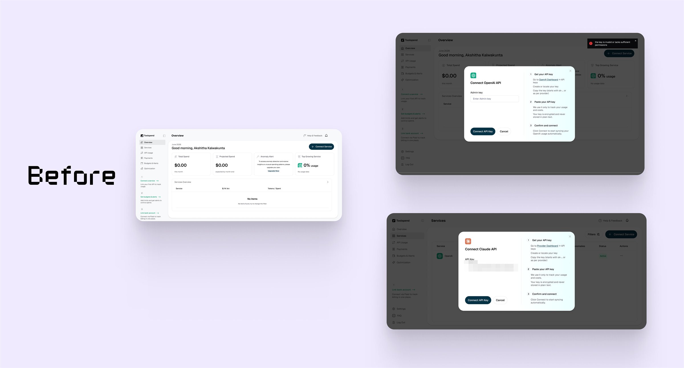
The first real step was connecting an LLM provider key. When it failed, users got a generic toast that flashed in the corner and vanished, with no indication of what broke. The setup instructions listed steps but never named the exact permissions the backend needed. And clicking "connect" produced zero visual feedback while the request processed.
Three failures stacked at the single most important moment. Users could not tell a wrong key format from a missing permission, so they guessed, or left the platform to dig through provider docs. Others clicked repeatedly into the silence, risking double-submissions and rate limits, and reading the dead air as a broken product.
This is the front door, and it maps to the funnel's steepest drop-off: activation rate. If the connection step jams, users never reach first value, and no downstream metric, retention, conversion, expansion, ever gets a chance to fire.
What changed
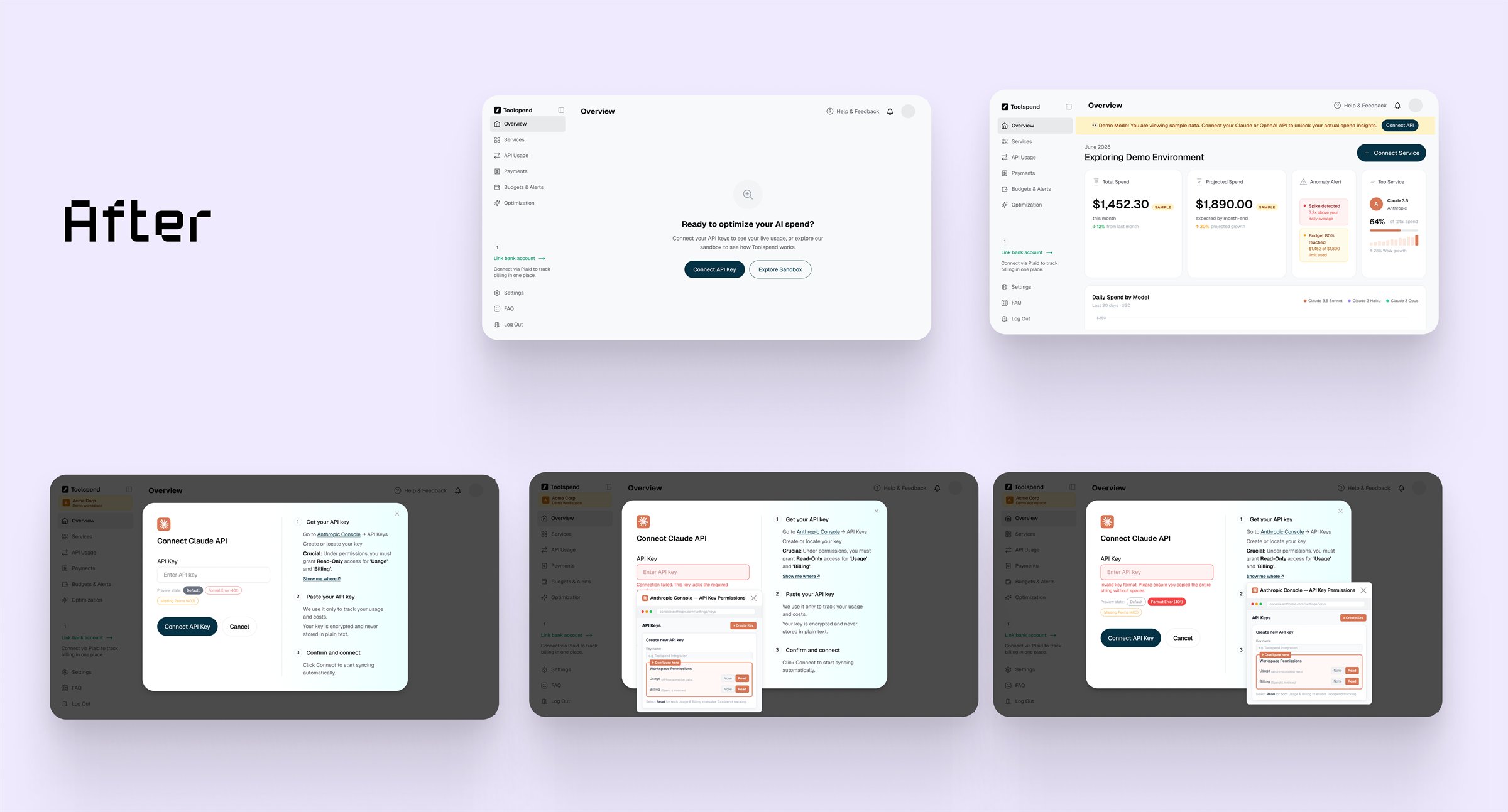
- Inline contextual errors under the input that separate a syntax error (wrong key format) from an access error (missing workspace permission), so the user knows exactly what to fix.
- The exact configuration named in the guidance, such as "Owner/Billing access" or "Read-Only permission," instead of generic steps.
- A "Show me where" trigger opening a tightly-cropped, annotated screenshot of the precise provider setting, so users never leave to find it.
- A real loading state: the button disables on click, the label switches to "Verifying...", and a spinner appears, so the user trusts the system heard them.
Every fix removes a guess. The user always knows what happened, what to do next, and that the system is working.
Leak 2. The room was empty, and the way out cost $40.
Users who failed or skipped the key connection landed on a blank dashboard, $0.00 and no data, with the core tabs locked behind a hard $40 paywall from the moment they signed up.
This is the imagination gap. A technical user was asked to pay for the premium plan before verifying the product even functioned, before seeing the dashboard hold data, before trusting the architecture. A dead-end empty state plus a premature paywall stripped out both motivators at once: the curiosity to troubleshoot the connection, and any reason to upgrade.
A hard paywall converts intent that has already been earned. It cannot manufacture intent in a user who has not seen the product work. Placing it at signup was charging for conviction the product had not yet built.
What changed
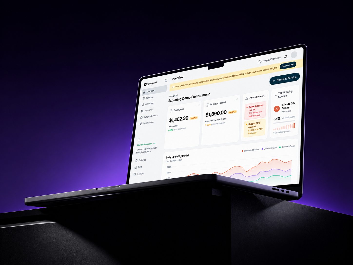
- A populated Demo Mode command center replacing the blank layout, with realistic sample spend, anomaly alerts, and live visualizations, so the product proves its value before asking for a cent.
- Silhouette paywalls instead of hard blocks: locked tabs show blurred, clearly valuable UI behind a clean upgrade modal, teasing the functionality rather than walling it off.
An outcome the user has never seen cannot be sold. Show the working product first, and the paywall closes desire instead of blocking a stranger.
Leak 3. Showing value without triggering panic.
Dropping users into a dashboard full of high-spend data ($1,452.30) created a new risk. If someone thought that was their bill, that Toolspend had linked to a live account and run up charges, they would panic. And the obvious fix, a top banner reading "this is demo data," fails, because users instinctively skip top banners. Banner blindness.
A user who believes they have been charged without consent does not just churn. They become negative word-of-mouth, which raises acquisition cost for every future user. One mishandled empty state quietly taxes the entire top of the funnel.
What changed
- An opt-in routing screen before the dashboard: "Ready to optimize your AI spend?" with two explicit choices, Connect API Key or Explore Sandbox. The user has to actively choose the demo.
- A de-personalized demo greeting, with distinct 'SAMPLE' pill tags and subtle watermarks placed directly beside the highest figures, intercepting the eye exactly where it scans first.
The routing screen is the real fix, and it is behavioral, not visual.
Because the user asked to see the sandbox, they carry the context that the data is fake. Panic is impossible when the illusion was requested. The SAMPLE tags are the safety net for the fast-scanning eye.
The through-line
Read together, the redesign inverts the funnel from commitment-first to value-first. It earns the user's trust and demonstrates the product's worth before the ask, so the paywall converts warm intent instead of interrogating a cold stranger. The connection step removes guesswork, the sandbox proves the product works, and the opt-in demo builds trust instead of fear. By the time a user reaches the paywall, they have already seen exactly what they would be paying for.
The work in one line
Activation was treated as a business system, not a set of screens. The point where a technical funnel was losing users was found, and every step was rebuilt to prove value before asking for commitment.
Validation
The redesign was validated with real users, run through both the original flow and the rebuilt one. The pattern was consistent. The original confused them and stalled them at the connection step, leaving them nowhere to go. The rebuilt flow let them move through connection to value without getting stuck.
Because the redesign was not shipped and measured, this study carries no performance metrics. The proof is the diagnosis, the mechanism behind each fix, and what real users experienced moving through the new flow.